Blocking Google’s AI bot crawlers

Google released some news about a new token that can be used to block their Bard and Vertex AI crawlers.

Google-ExtendedA standalone product token that web publishers can use to manage whether their sites help improve Bard and Vertex AI generative APIs, including future generations of models that power those products.

Time to edit my robots.txt file again.

(See Here’s how to block OpenAI’s bot crawlers in your robots.txt file for why I’m blocking them.)

Block Google’s AI bot

Straight from the source: https://developers.google.com/search/docs/crawling-indexing/overview-google-crawlers

User-agent: Google-Extended
Disallow: /

That’s the important bit. It’s not even an example on the page, but at least the user-agent info is.

Happy times.

I don’t mind opting-in to things I consider helpful to the world at large. But this opting-out business is ridiculous. Businesses take intellectual property seriously when it’s other people trying to benefit from their property. But when they want to benefit commercially from other people’s property, they have no problem skipping the permission phase and hoping no one cares later.

Obviously I just don’t like change

So I’m all aggravated about the WordPress 5.0 block editor, and I log in to my Gmail account because in all the aggravation of writing that big test post with images in it, I’m making links to some books and I accidentally buy an ebook from Amazon that I don’t need. I’ve already read the book through the library, so of course I returned it immediately, but now I’m logging in to Gmail to check something and I realize there was a reason I don’t log in to Gmail anymore.

I use Thunderbird to check my email or I use my phone. Because Gmail’s web interface is the most godawful thing I’ve seen this decade. Unless you count Google Calendar, because that thing looks like it was made for a six year old. Anyway. Now I’m just depressed because obviously the taste of the people creating all this stuff is becoming so far removed from me that I’m thinking I’m pretty much guaranteed to have to learn to live with a whole lot of things I hate for the rest of my life.

The irony is that Google keeps sending me notices that one of my websites has accessibility issues because the text is too small to read (it says), but the text on the website in question is considerably easier to read than the soft, fuzzy, not really dark enough mess that is the text on Gmail’s page. Staring at that page just gives me a headache.

I really should have spent my evening writing. It would have been a lot more fun.

Weird ways I use my calendar

I use a Google calendar for all kinds of things, most of them very normal. I use it for my scheduled appointments and events, and I use it as a task list. I hear you’re not supposed to do that, and I understand why because I’ve read the trusty Getting Things Done book.

I found a lot in that book that helped me set up some systems that I continue to use nearly ten years later. But I still choose to use my calendar for tasks. My brain doesn’t do well with stuff that is out of my sight. I’m very much an out of sight, out of mind kind of person. And when I’m not, it’s because I haven’t been able to stop thinking about whatever thing it is I’m afraid is out of sight and will be out of mind shortly. :)

Most tasks are just set up as “All Day” events and when I finish them, I add a “+” at the beginning of the event name. It’s easy and it lets me search backward when I need to.

Such as: when was the last time I reconciled my accounts in GnuCash? Ah…that’s right, August 20th and it wasn’t part of my normal routine, because I didn’t “+” the event, I added a new event straight into the calendar. :)
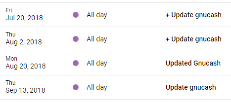
But then there are the weird things, like my weight.

I set up my weight as an event and throw it in there every so often just so I can look back and see where things stand. Search makes it easy since the keyword is “pounds.”
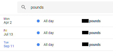
Personally, I appreciate the broad overview this gives me. It’s easier to see significant changes when you get rid of extraneous data like what you’d see in a daily log.

I also keep affirmations of one kind or another in my calendar. I have some of them set up as recurring All Day events, so just about the time I’m likely to forget them, they pop up again.

I add All Day events for anything I want to remember, really, from “stray kitten arrived” to “woke up with vertigo” (which happened last week).

I recently created a calendar called “Writing” (separate from my publishing calendar) and I think I’m about to start using it in the same way for memorable stuff related to my books. Stuff like “came up with twist for SB” (SB = Some Book). :)

The one thing I don’t do is use my calendar to track my daily word count. Too much data. If I search for “words” I would be sure to get pages and pages of useless info, because I already keep up with my daily word count in a spreadsheet.

But now that I’m thinking about it, I am definitely going to add a yearly word count to my calendar. I do have a yearly word count summary in my spreadsheet, but the numbers are spread out and not so easy to see side-by-side. I don’t want to make any changes to my spreadsheet, so this will give me a different option for viewing my year-end word counts.

Seriously, Google?

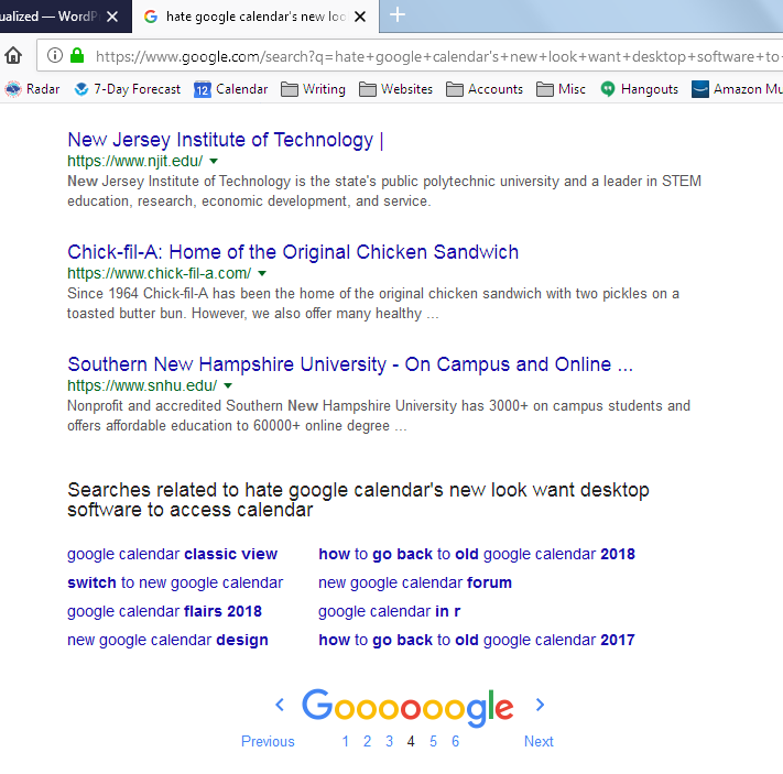
Google is dying. How do I know this? Because I searched for something today and on page 4 (just page 4), the results were so nonsensical that it really makes me question whether or not Google is any good as a search engine any longer.

I mean, seriously.

My terms weren’t in good order, but they weren’t weird, by any means.

hate google calendar's new look want desktop software to access calendar

Because yeah. I’m still stuck on that. :)

Here’s what made me go “huh?”

I don’t even know what to say about this because it shows such a decline in quality of search results that it’s left me speechless. There should have been far more than 4 pages of results for these terms that were a better fit than Chick-fil-A. Right?

Forget that, I know I’m right.

:D

Apparently, Google’s day has come and gone.

The new Gmail interface makes me miss Yahoo

I don’t know who it is that Google’s designing for, but the new Gmail (and Contacts) site as viewed on my computer screen reminds me of a large print book. For babies. Maybe that’s who they’re designing for! I don’t know. But the colors are blindingly bright and the white space is so excessive that it makes me miss Yahoo (which I pretty much hated).

First it was Google+, then Calendar, and now Gmail. I’m seriously ready to abandon them all. Actually, I did abandon Google+. I also avoid visiting the Google Calendar website unless I have to now, after using it for my homepage for years. Trust me when I say it is not my homepage any longer. I stick with my phone’s Google Calendar app, because at least they did that right.

Anyway, I’m just venting. I’m so frustrated by all the design trends that are ruining website usability for actual computer users. I realize mobile is huge these days (I myself spend a lot of time online on my various devices!), but there’s just no need for designers to ruin the screen versions of websites to make a mobile site work well.

Sigh.